UD ♥ NYC (this is a loooong review!)
Click on photos to see them bigger!
General information;
I love Urban Decay, their quality and unique products, their big fat NO to animal testing, and even their vegan friendly products (I’m no vegan but it must be nice for Vegan’s to actually have a product line that is catering for their lifestyle choice.) I am however going to show the good and bad points of this palette, and just because I like the brand I wont necessarily sugar coat the negatives. I also bought this palette myself, just in case that makes a difference to anybody.
There has been less buzz about this Book of Shadows (which for some reason I keep calling a “box” of shadows -__-) then the Alice in Wonderland one maybe because it is less limited (there were only 2000 in the UK of Alice in Wonderland), but also there hasn’t been as much of a wait for BoS vol.III to hit the net in comparison to the long wait suffered for the Alice in Wonderland. Or maybe people just prefer Alice to New York! I will update with the limited edition information when I find out.
So here’s the deal, it is a Debenhams online exclusive however it may make an appearance in some stores at a later date. I am not sure how many are available in the UK however it is more then 2000 this time round. It goes for £30 (not including the overpriced P&P which is £3.99, even though they post it 2nd class 2-5 days and it should cost half of that to send it by that method.) Mine also came scratched and a little dented, thank-you for treating luxury and expensive items so well Debenhams! /rant!
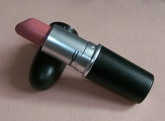
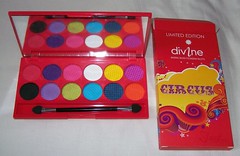
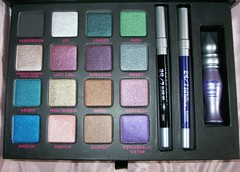
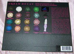
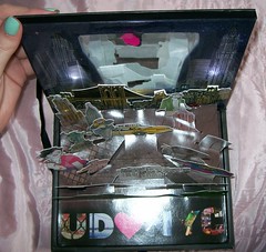
The format is standard for the Book of Shadows. It has a pop up top displaying a New York Scene, although it also comes complete with up-pointing LEDs lighting up the New York skyline. The draw beneath the pop up top houses the 16 eyeshadows (7 LE specific to this palette, 1 LE available in another palette, 2 Sephora exclusives and 6 permanent shades). The 24/7 liners are Zero (as per usual) and Ransom. And the mini primer potion is also there.

Here is a breakdown of the shades…
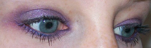
Limited edition shades;
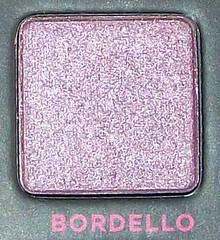
Bordello
Kush
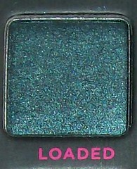
Loaded
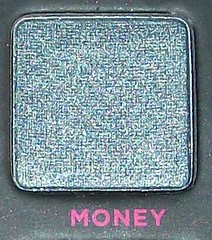
Money
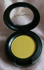
Radium
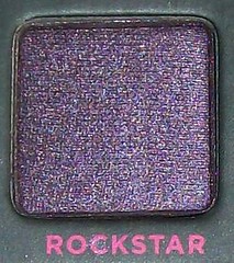
Rockstar
Suspect
Snatch (also in Show pony palette)
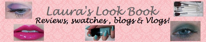
Sephora shades;
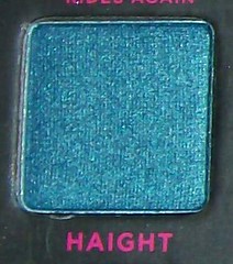
Haight
Psychedelic sister
Permenent shades;
Last call (also in Alice in Wonderland)
Maui wowie (also in Alice in Wonderland)
Midnight cowboy rides again (also in Alice in Wonderland)
Smog
Perversion
Uzi
So, onto the review and more pictures!
The Eyeshadows;
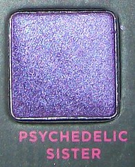
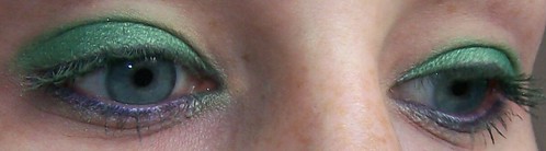
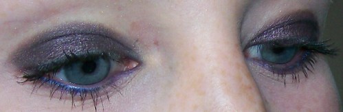
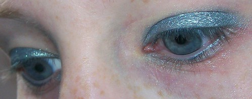
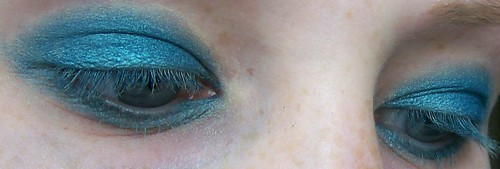
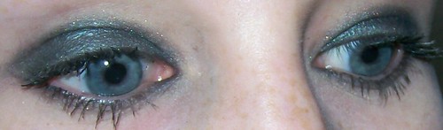
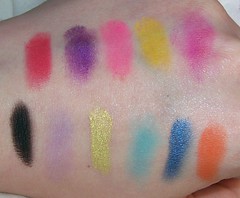
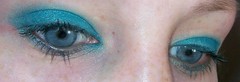
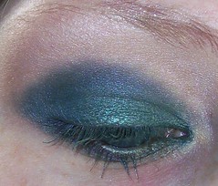
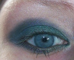
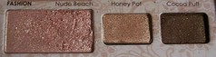
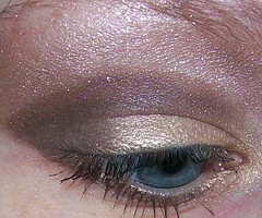
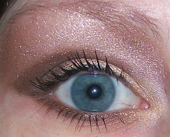
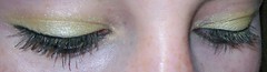
OK, first off these are unusual and I’d say highly difficult to dupe colours. They are said to be “complex colours” on the paper that comes with the box and I would agree, they are very unusual and lovely colours. A problem I have with this is the same problem I had with the Alice in Wonderland one, and that is that there are too many similar colours, all the neutrals are similar, all the purples are similar. No orangey, reddy, yellowy colours to be seen and only one blue. There’s a teal and 3 types of greens… it seems too little variety, which is silly considering there are 16 colours which should give you tonnes of variety! So yes the colours are nice and complex, but if you dislike greens, or neutrals, or purples you may as well not bother as that is pretty much all the palette contains!
As aforementioned in my previous post, there is only one matte, I can imagine for people who want a more work/school friendly look this is a pain in the bum considering these are pretty much shimmers and the only matte is jet black! So, a little variety in texture also wouldn’t go a miss (I’m more of a shimmer lover myself!) However, personally what I love in this box is that there are only 2 glitters, that damn cowboy that won’t go away and Uzi. I love the shimmers and so the fact there are virtually no glitters I wont use fills my heart with joy! There are a couple such as money and Bordello that do have little bits of glitter as well as shimmer, but not to the same extent. Yes I have just ranted about lack of textures, but for me personally these are the most gorgeous texture and pigmentation and no glitterball fallout to be seen!
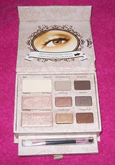
The aforementioned paper that came with the box;
The ethos;
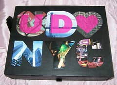
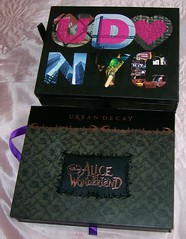
It’s about time homage was paid to NYC! I love the ethos surrounding the palette. Most girls love New York or at least the idea of New York, if its sex and the city’s fashion and romance or Will & Grace’s fun and friends, or maybe even the culture or architecture, there are plenty of reason’s to love the city! The graphics on the front of the box is well done and different, I like how simple and clean it looks and how each letter represents a different aspect of New York. The pop up graphics inside show different types of people from New York, the scenery, the different fashion and some of the different landmarks and famous buildings. It is a nice touch, however the LED lights are overkill in my opinion, they wont last all that long, it’s just something to go wrong, plus it is unappealing how you can see the little red wires!


To the far right of the pop up design, next to the green man, you can see the red wiring (it’s a lot more obvious in real life).
The Packaging;
Enough has been said by me already on these bloomin’ LED lights, so no more shall be said! The packaging is cardboard and paper, although it is hardy and the design is nice, at the end of the day if it is just cardboard, it will wear and tear a lot more quickly then if it were plastic. Though I like the idea it is biodegradable. The ribbon pull is robust and it isn’t too difficult to open (unlike the Too Faced eye kits which are nightmares to pull open!) It is quite a bulky palette, even bulkier then the Alice in Wonderland one, but it isn’t too heavy in weight. The magnetic catch on the pop up top is very strong, it is very difficult to open, it takes two hands to open it!
See the depth of NYC BoS is a lot bigger and bulkier then the Alice in Wonderland one, though the lengths and width are much the same.

Overall I am so glad I bought this, I love the colours. I’d say so far my faves are Haight and Bordello, though with use that may change… Loaded and Money may change my mind :] I just wish there was a bit more variety and it wasn’t so bulky, but other then that I am a happy customer.