Wednesday 29 September 2010

Review; Urban Decay Summer of Love "Aquarius"

Urban Decay Summer of Love Nail Kit
Urban Decay Summer of Love "Aquarius"

This was, to me, the most eye-catching of all the kit's shades. The formula was a little disappointing since the kit was so expensive. The colour is very sheer, I needed countless applications to get this opaque, and it didn't dry all that quickly, it also dyed the skin around my nails when taking it off. The colour is nice and shimmery and a gorgeous shade, but it is easily dupable. So I would use it again, but it wasn't worth the cost!

Urban Decay Summer of Love Nail Varnish "Aquarius"

Review; MAC Varicose Violet Nail Lacquer

MAC Varicose Violet lacquer Dame Edna collection

This lacquer was from the "Dame Edna" collection. I like the texture of this, it is a frost, which means it is a little sheer as it isn't as thick as the creme lacquers, however it doesn't stay soft on the nail, and therefore it doesn't get dented. This colour is buildable with a few coats, and the colour is really worth it. The colour is lilac with dark purple/bluish shimmer, so it has a little iridescence to it when the light hits it. It is a lovely purple polish, however I wouldn't say it is a must have. The frost formula means it is a little more bearable then other MAC lacquers.

MAC Dame Edna Varicose Violet

Review; MAC Seasonal Peach Nail Lacquer

MAC Seasonal Peach Lacquer Cremesheen collection

This was from the "Cremesheen Collection" and it is a cream texture, naturally. This is a gorgeous colour, however it is so sheer that it needed about 4 coats because it went streaky and took a few layers to get it opaque and even. Once you get it opaque and even it is a really lovely peach/light orange with a pinky tone. Like the Alice+Olivia Morning.After lacquer which is also a cream, this is soft on the nails days after application and can dent.

Definitely one of MACs least impressive shades formula-wise, but colour-wise it is a lovely polish.

MAC Seasonal Peach Nail Lacquer

Review; MAC Blue India

MAC Liberty of London Blue India nail lacquer

This nail lacquer was from the "Liberty of London" collection. It is a really unique greyish dark teal, I am not sure what would be a dupe for this colour. The finish of this lacquer is cream, however unlike seasonal peach it isn't streaky and sheer, and unlike Morning.After it doesn't stay soft and dent days after application. You really don't need more then 2 coats of this, as it is very pigmented and thick. The bottle has a cute bird on it, and I just wish all the limited edition varnishes had prints on the bottles, but this seems to be the first one that has an image on the bottle.

MAC doesn't do the best nail lacquers, however this is one I was impressed by.

mac liberty of london blue india

Review; China Glaze Temptation Carnation

temptation carnation bottle

This is a very transparent colour. It is a pink colour with some iridescence to it. This is perfect if you want subtle nude nail colour with a bit of a shimmer, or if you want to jazz up a french manicure. It could also be nice over the top of another nail polish colour as a top coat with a pink iridescence. However, it will never be opaque, no matter how many coats you do.

China Glaze Temptation Carnation swatch

Review; China Glaze Cowardly Lyin'

china glaze wizard of ooh ahz collection Cowardly Lyin'

This is a nice enough colour, but it is very very sheer and needs a fair few coats to get it opaque. This goes on as it appears in the bottle, however a little sheerer then the rest of the colours from the same collection, it is a yellowy gold with gold glitter. This is definitely not my favourite from the Wizard of Ooh Ahz Returns collection, it is just too sheer for a China Glaze nail varnish and although I love yellowy gold colours, this polish just didn't wow me, it just lacked that special factor. I think it appeared more yellow then gold in certain lights and this put me off a little.

China Glaze Cowardly Lyin' Wizard of Ooh Ahz collection

Review; China Glaze For Audrey

china glaze For Audrey

This is one of the nail polish shades I have been most complimented on, by both men and women, whenever I wear it. I originally bought it because my Mum is named Audrey and it is her favourite colour is turquoise, and it is also her birthstone, so it reminded me of her. The fact it is such a cult and awesome product just happened to be an added bonus. It is a beautiful green tinged blue, I wouldn't know whether to call it an aqua or a turquoise, either way it is a very bright, cheery and flattering colour! This really brightens me up when I wear it. I really like Chanel, and was GUTTED with a capital G when I couldn't get Nouvelle Vague, however this China Glaze shade is the closest you are ever going to get, and it's good quality and cheaper by about £10! I am therefore not as heartbroken :]

If you can get it, go for it, I doubt you'd regret it.

Too Faced Glamour to go Size

Review; Too Faced Glamour To Go Pocket Palette

Too Faced Glamour to Go


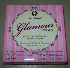
I had mixed feelings about this palette when I got it. I shall explain why in sections...
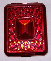
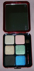
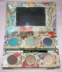
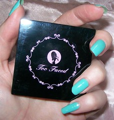

Size/packaging;

It is very, very small! It can fit on the palm of your hand. For the money, the size is pretty appalling. I get that it is for travel, but this is so small it is bound to get lost in your bag. I also had reservations about how small the eyeshadows were since there is no way you could get a brush in there! I also would prefer more eyeshadow colours then lipglosses, but that's just me. The packaging is chunky but sturdy, and I guess the brushes are useful since no "normal size" brush would fit into the eyeshadow pans, and normal lip brushes would probably take up half of the lipgloss from the pan! However, because they are so small they are difficult to use, and I never find sponge applicators that useful.
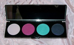
Too Faced Glamour to go Size

Eyeshadows;

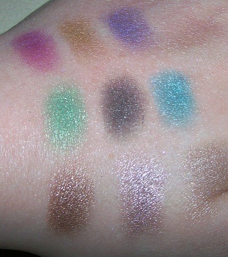
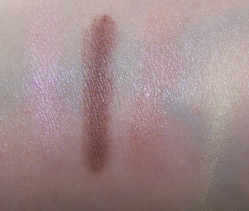
The eyeshadows are lovely colours! Very neutral and wearable everyday colours.

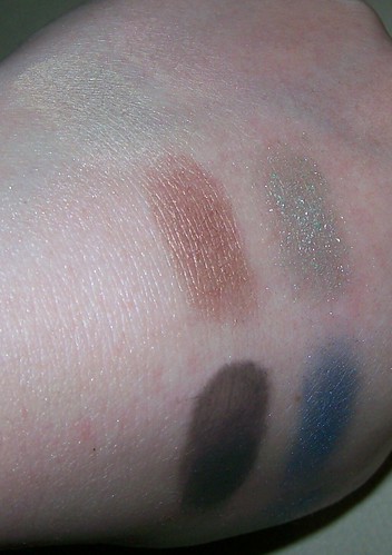
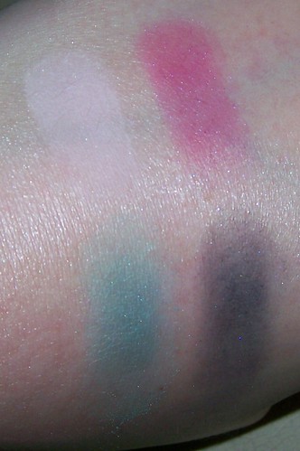
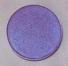
The pink has a lovely iridescent shimmer to it, however it isn't hugely pigmented in comnparison to Urban Decay shadows (considering they are around the same price), and it needed a lot of applications to get the colour to show up. It is definitely the least pigmented out of all of them, which is a shame as it is the nicest shade in my opinion.

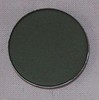
The dark brown is the most pigmented, and it also has glitter specks in it, however not so much that it takes over or has a load of fall out. This shade showed up very easily, and didn't need multiple applications to get it to show up, unlike the pink colour and nude colour. This would make a nice crease colour.

The light brown isn't all that pigmented, but didn't need as many applications as the pink and nude to show up. It is a nice shimmery colour once you get it to show up.

The nude took a few applications to show up, it is quite light, but a little more pigmented then the pink. This shade, like the dark brown, also has specks of glitter in it, however not so much that it makes you look like a disco ball. This is a very pretty but subtle colour.

Too Faced Glamour To Go swatches

Lipglosses;

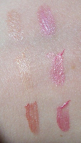
These lipglosses are pretty much all the same colour, there's the goldy beige colours and the pinks... that's about it! One thing I hate about Too Faced lipglosses is that they stink of plastic/chemically grossness. I haven't found a pleasant smelling one yet! Considering how MAC glosses smell, Too Faced have a long way to go in the gloss department. The colours are nice and pigmented, and aren't overly sticky, however they are quite thick and gloopy. I also had an allergic reaction to these glosses after swatching them on my hand, and that's never good, and I am now far too dubious now to put it on my face. I do have sensitive skin, so keep that in mind.

Too Faced Glamour To Go Lipglosses

So overall, overpriced, under-sized, but a nice "everyday" look palette, that unfortunately doesn't have bags of variety. This is to me the C grade student of the eyeshadow palette world.

Tuesday 28 September 2010

Review; Sugarpill Pressed shadows

Sugarpill eyeshadows!

The ethos;

The ethos is "A delicious fix for color fiends! Richly pigmented luxury pressed eyeshadows in striking hues. The velvety smooth texture allows flawless application and superior blending ."

I would agree with all of that. These shadows are definitely for color fiends as the colours are so bright and vibrant. They are richly pigmented and luxury definitely does come to mind. They are very striking shades, smooth and they do apply and blend perfectly. So everything they say I personally agree with!

sugar pill box back

Sugarpill, like Urban Decay, MAC & Too Faced, is against animal testing, which I am glad for as I wouldn't have touched this product had it not been anti-cruelty! More brands need to follow suit!
sugarpill anti cruel


The packaging;

The artistry of these products are adorable and just divine, I can't stop looking at it! From the fonts to the kawaii illustrations and bright colours, they match the vibrant and luxury ethos perfectly!
sugarpill box

The eyeshadow containers themselves are sturdy, and have the cute Sugarpill symbol on the top.
sugarpill front

I love the large sans serif font on the description, but also the cute "cruelty-free" cute cat on the bottom!
sugarpill back


The colours;

I have 3 colours so far, Midori (green), After Party (Blue) & Dollipop (Hot Pink). The colours are very soft and highly pigmented and vibrant, shockingly so! It applies and blends with ease, and the shades translate exactly to the skin as it appears in the pan. Midori & After Party are shimmers, and they have a lovely shine to them. Dollipop is a matte, however is just as soft, smooth and easy to apply/blend as the shimmers!

Midori
Sugarpill midori

After Party
Sugarpill After party

Dollipop
Sugarpill dollipop

sugarpill swatches

Worth the price?

ABSOLUTELY!! From £8.50 at Love Makeup.com it is cheaper then MAC, yet high end quality and you get more product. They remind me a lot of make-up forever in quality and size. You definitely get a lot for your money. It is not worth it if you are a fan of more neutral colours though!

Review; MAC Heatherette Hollywood Nights

MAC Heatherette Hollywood Nights

This is a gorgeous hot pink Barbie doll shade! Not only is the shade of the lippy cute, the pink and holographic packaging is adorable too! It is a very pure pink, and doesn't have the hint of purple/fuschia that Girl About Town has. It is very bright and pigmented considering it is a satin, and has longevity on the lips.

However I wouldn't wear this without a gloss as it was quite drying and made the lips a little wrinkly (that or it just excentuated lines that were there that I haven't seen before!). I'd say that was the only drawback, the lipstick is pretty much "what you see is what you get" apart from the drying texture.

MAC hollywood nights

Review; MAC Passions Of Red Devoted Poppy Compact

MAC Passions of Red Devoted Poppy compact

This compact was such a let down for me! Firstly I wasn't really into the "blingy" decoration, however I loved the colour selection, the fact it would be good for travel since there was a good selection of shadows, a mirror and a brush, and so I bought it anyway at my CCO. The colours swatched okay, however there is only one or two that really applied well.

Sweet eyes basically doesn't show up at all. It is meant for a highlight colour, but on me it just vanishes and doesn't show up at all.

Young things is pretty much the same as Sweet eyes, it just seems to vanish on the skin. It is supposed to be a light pink/highlight. They both seem to disappear on the swatch below! Very difficult to see.

Amorously is the best shade in the palette. It is the smoothest, most pigmented and applies the best. The colour is lovely and shimmery, and it is a shame the other shadows don't apply like that!

Awaken disappointed me so much! I really thought this would be my favourite colour out of the compact, however it isn't as pigmented as I thought it would be and it crumbled and went patchy when I was using my eyeshadow brush! The swatch was as pigmented as I could get it. It is the Heatherette Palette all over again. Mood Ring was so beautiful and I wanted to love it, but it needed a million applications to get it to show up as the texture was so bad, however in that palette mood ring was powdery, whereas awaken in this palette is crumbley.

In Awe is pigmented, however the brown glitter that is shot through it does not show up at all. It appears more black in the pan however applies more brown. It isn't my favourite colour or texture, but it's one of the best out of a bad bunch as at least the colour shows up and it applies evenly!

Fall Deeply was, like Awaken, a colour I thought would be a favourite, and although it applied better then awaken since it wasn't clumpy and crumbley, it wasn't as pigmented as I thought it would be and this made me sad as it took many applications to show up.

Overall, really quite disappointing eyeshadow wise! They looks so gorgeous and shimmery in the pans, but they really don't translate well to skin.

Passions of red Devoted Poppy swatch

Review; MAC Hello Kitty Too Dolly Quad

MAC Hello Kitty Too Dolly Quad
MAC Hello Kitty Too Dolly shadows

This is a very bright and girly quad. The packaging is cute for those hello kitty fans, and it is small with a little mirror and also very sturdy which makes it portable. There is the highlight colour (Yogurt), two bright colours which work well together (Romping & Too Dolly) and a dark colour with blue/green glitter (Stately Black) which could make a smokier look. This is definitely for someone who prefers the brighter look.

Yogurt is a very light, not overly pigmented highlight colour, however it is very smooth and works well as a highlight.

Romping is a unique hot pink which is very pigmented, but it doesn't have the softness of a veluxe pearl as it is a frost. It is easily applied however needs a couple of applications to get it to the optimum shade. I haven't been able to find a permanent MAC equivalent for this shade yet.

Too Dolly is a lovely bright blue shade. I'd say this colour translates well from the pan to the skin, as the colours from this palette seem true to colour. In terms of application and texture it is very much the same as romping.

Stately Black is a very pigmented black shade, however the glitter doesn't really show through and there is a lot of fall out from this shadow. It is very easy to apply and blend, but it can get a bit powdery and you definitely notice this when it ends up all over your face since the fallout is very bad!

MAC Hello Kitty Too Dolly swatches

Review; The Urban Decay Deluxe Palette

Urban Decay Deluxe Eyeshadow palette

This is a super palette! The minimal but shiny packaging, is a nice touch, however the velvetty cover is bound to get dirty, but I love the silver and purple colour scheme. The colours on their own are quite expensive, however all together in the palette it makes them a lot more affordable and more travel friendly. The sponge applicators to me are pretty useless, however with the sponge applicators and the mini primer potion this will make it perfect for travel for some people since the palette is also slim and light. However I don't use the primer potion either so to me I just need the palette.

These are definitely the best of Urban Decay shadows. These are lovely unique shades and are super soft, pigmented and smooth. The colour selection is a brilliant mix, and I don't know how I went without it since now I take it on travels with me over my other palettes! I can't really think of any cons with this palette, it is a shame they don't have another palette with the remaining deluxe shadows that are not in this one!

Urban Decay Deluxe palette swatches

Review; The Urban Decay Vegan Palette

Urban Decay Limited Edition Vegan Palette

This palette is cruelty free (though all Urban Decay products are) and animal byproduct free, so it is suitable for vegetarians and vegans. It makes me wonder what kind of ingredients are in regular make up for it not to be suitable for vegans. Anyway I digress! The selection in the top row is good as they are all varied and colourful, however the bottom shades are all very similar. The top row are all glitters and the bottom row are all shimmer, I am more of a shimmer fan so I am sad the top row aren't shimmers as well, as they would be smoother, softer and more vibrant of they were.

Minx looks like a greeny teal in the pan, however it goes on a lot more green however doesn't go on all that smoothly and you need a fair few applications to get the colour to show up fully, it tends to look patchy due to the glitter.

Urb is a light green in the pan, however it shows up more browny coloured. It isn't as pigmented as the shimmers and there is fall out from all the glitter. I really wanted to love this, but on the skin it isn't the colour I expected it to be.

Gunmetal in the pan is a shimmery silver, however on the skin it is black based with silver glitter. I would have preferred this if it was more like Barracuda (a silver shimmer). The pigmentation is better then the other two glitters, however if it was a shimmer it would have been a lot more pigmented!

Twice Baked is a dark brown shimmer, however I found it kept going on a little patchy and isn't as shimmery as the other two. It is still a nice colour and it is pigmented, however it could be more smooth.

Smog is a beautiful colour, very soft, pigmented and a lovely colour (also available in the Naked Palette), not much more to say about it I think the swatch says it all! :]

Half Baked is a golden brown, and is very pigmented and smooth and a little different to the browns since it is more gold in tone. It , like Smog, is also in the Naked Palette. Again, not much to say about this one, the quality speaks for itself.

Urban Decay Vegan swatches

Review; The Urban Decay Black Palette

Urban Decay Black Palette

This palette isn't what I expected. I expected black shot through with colour, however all the shadows are a little different.

Black Dog is a very pigmented matte black which is a staple for smoky eyes, and so it is good it is included in the set.

Barracuda is a black based shimmery silver. This colour is very smooth to apply and pigmented, definitely one of the best from the palette.

Jet comes through very dark purple rather then black based with purple shot through it, it also has glitter through it. It is very pigmented, but would have been nicer as a shimmer, but it will definitely add a lovely colour to a smokey eye.

Sabbath is a deep blue that reminds me a little of Deep Truth by MAC. It isn't all that black based, though it is a very dark blue. It is more shimmery then glittery and it is a beautiful shade and so soft and smooth to apply. It would definitely work for a smokey eye.

Cobra is supposed to be a black with yellow shot through, however I find it just looks brown with glitter. It wasn't what I expected and I was a little disappointed with this shade! I will try it applied wet and hope it applies better, but so far applying it dry by dabbing rather then swiping hasn't worked to get the effect I want.

Libertine is supposed to be black shot through with green, however to me it just looks like a glittery black, the green doesn't show through, even when I dab it on rather then swipe. Like Cobra I will try applying it wet and hope the colour comes through. I was disappointed with this shade applied with a brush.

Urban Decay Black palette swatches

Saturday 18 September 2010

Reviews you can expect...

In the near future!

haul 18/9/10
The Urban Decay Black palette
The Urban Decay Deluxe palette
The Urban Decay Vegan palette
MAC Passions of Red; Devoted Poppy (classic eyes)
MAC Rebel Lipstick
MAC Style Warriors Mercenary Nail Lacquer

MAC Sushi FlowerMAC Stars N' RocketsMAC Brun
MAC Sushi Flower
MAC Stars N' Rockets
MAC Brun

Hopefully I won't be too long in coming up with them!